
About The Brand
Elevate Talent Solutions is a dynamic consultancy bridging the gap between exceptional talent and thriving organizations. With a global reach spanning the UK and UAE, we deliver tailored recruitment, HR, and payroll solutions. Our mission is to ignite potential, fostering a world where businesses and individuals ascend to new heights. Driven by innovation, inclusion, and an unwavering commitment to excellence, we empower our clients to navigate the future with confidence.
Target Audience
Elevate Talent Solution’s target audience appears to be businesses of all sizes, from startups to multinational corporations.
Design Response
Reimagining Elevate Talent Solutions' visual identity. By meticulously analyzing the brand's core values and target audience, I crafted a fresh logo concept that encapsulates innovation, inclusivity, and excellence. The design's captivating aesthetic differentiates Elevate in the competitive landscape, making a lasting impression on clients and talent alike.
Current Logo Issues

Has an extremely outadated and generic look.
Too busy and lacks any form of appeal.
Barely legible when smaller in size.
New Logo Design Options

The logo for Elevate Talent Solutions features a contemporary design centered around the letters "E", "T", and "S". These letters are arranged in a square shape with overlapping elements, creating a dynamic and visually interesting composition. The color palette is vibrant and energetic, incorporating shades of pink, purple,, and yellow. The design is modern and eye-catching. The company name is displayed below the letters in a clean sans-serif font, providing clarity and balance to the overall design.
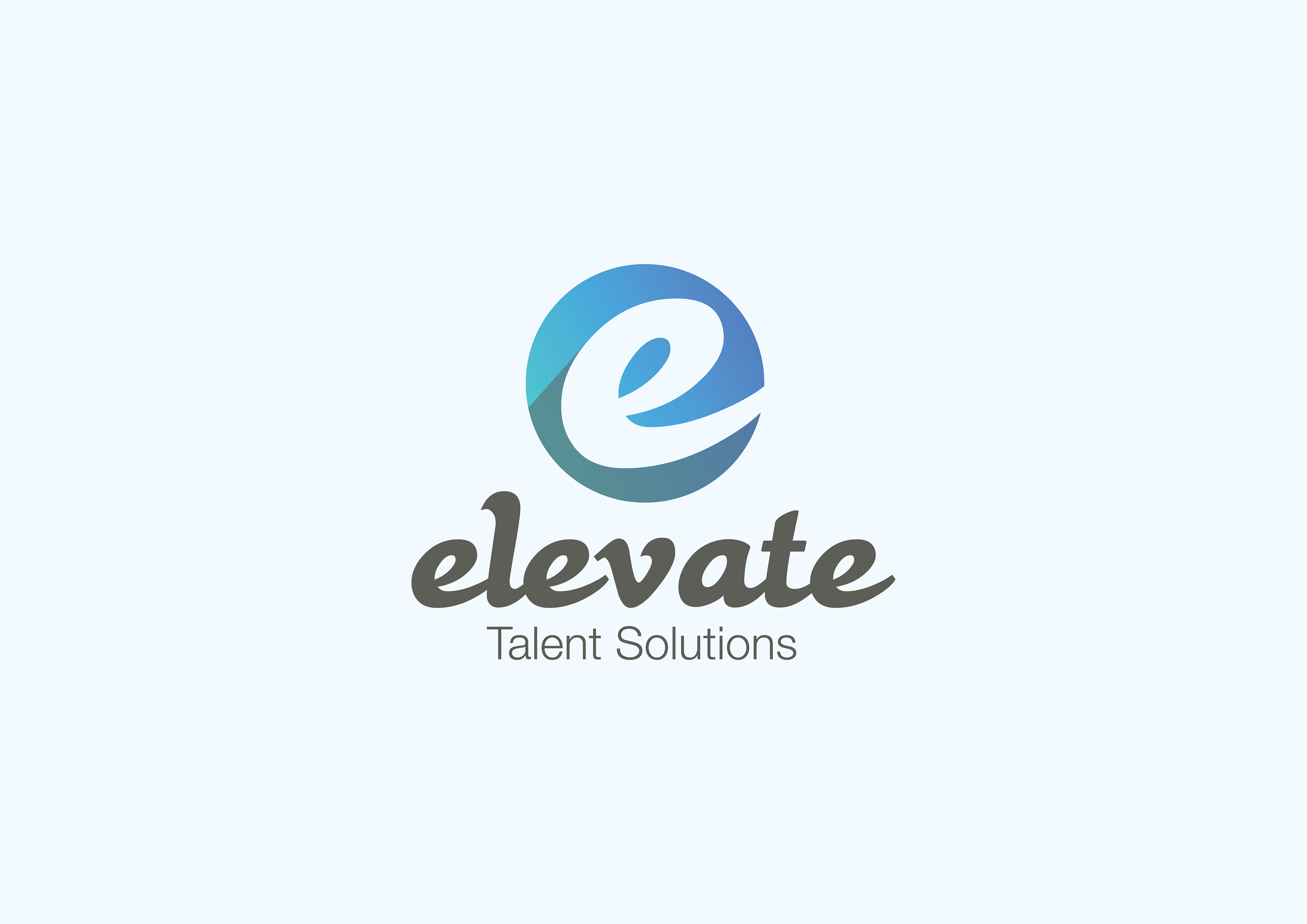
A stylized "E" is prominently featured within a circular gradient of blue hues, suggesting growth and professionalism. The typography of "Elevate" is handwritten, adding a touch of personality while maintaining readability. The overall design conveys a sense of reliability and expertise, aligning with the core values of an HR recruitment agency. The lowercase lettermark of "e" might give an illusion of a mountain from far portraying a sense of company growth with an enhanced workforce.
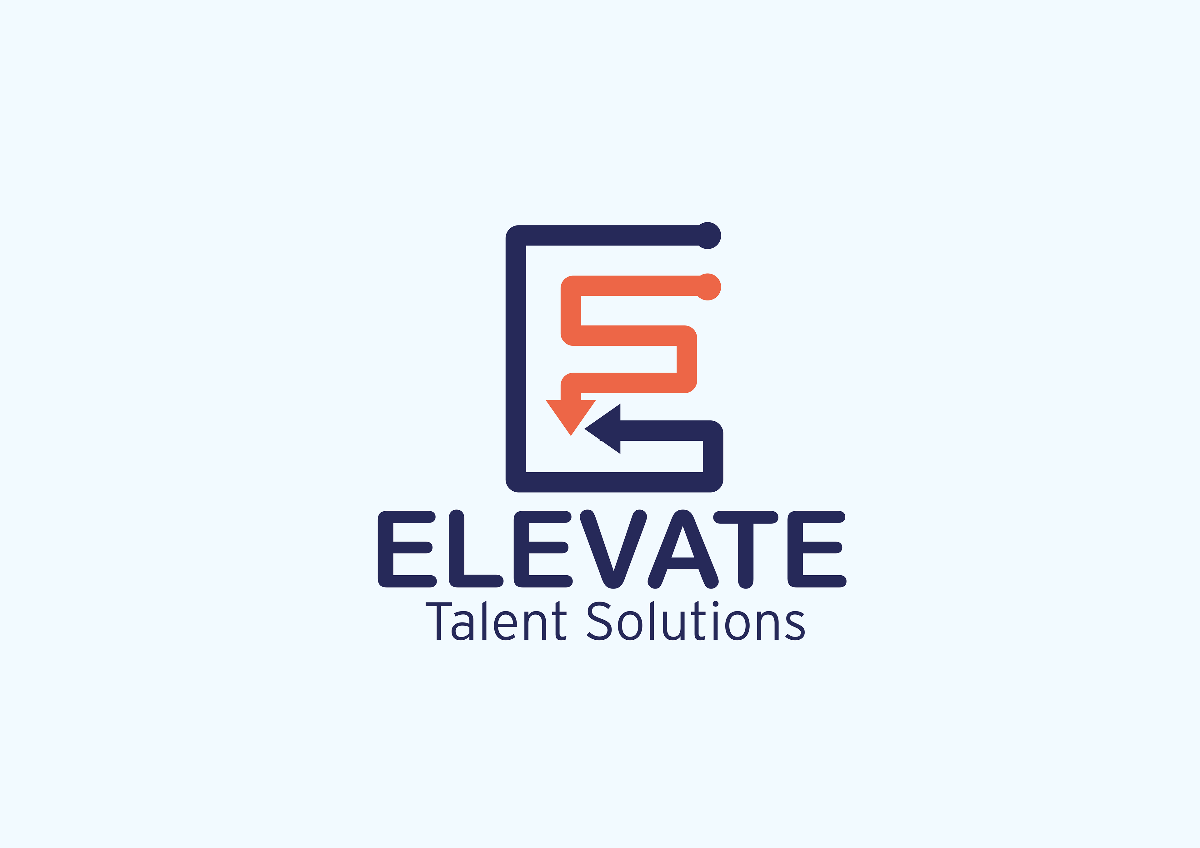
The above logo features a minimalist and geometric design centered around the letter "E." The "E" is formed by a combination of a square and a curved line, with a downward and sideways arrow poining each other within the shape. This suggests a sense of direction and progress with our services. The color palette is composed of navy blue and a warm orange, providing a professional yet approachable feel. The company name, "Elevate Talent Solutions," is placed below the symbol in a clean and modern sans-serif font, maintaining a consistent visual style. The overall design is clean, modern, and effectively conveys a sense of professionalism and forward-thinking, aligning with the company's focus on talent solutions.

The Elevate Talent Solutions logo presents a clean and professional aesthetic. A key-shaped icon serves as the central element, symbolizing access and solutions. The letter "E" is incorporated within the key head, representing the company name and potentially implying expertise or elevation. The color palette is composed of a rich blue, conveying trust and reliability. The company name, "Elevate Talent Solutions," is placed below the icon in a modern sans-serif font, maintaining a consistent visual style. The overall design is simple, yet impactful, effectively communicating the company's role in unlocking talent and providing solutions.
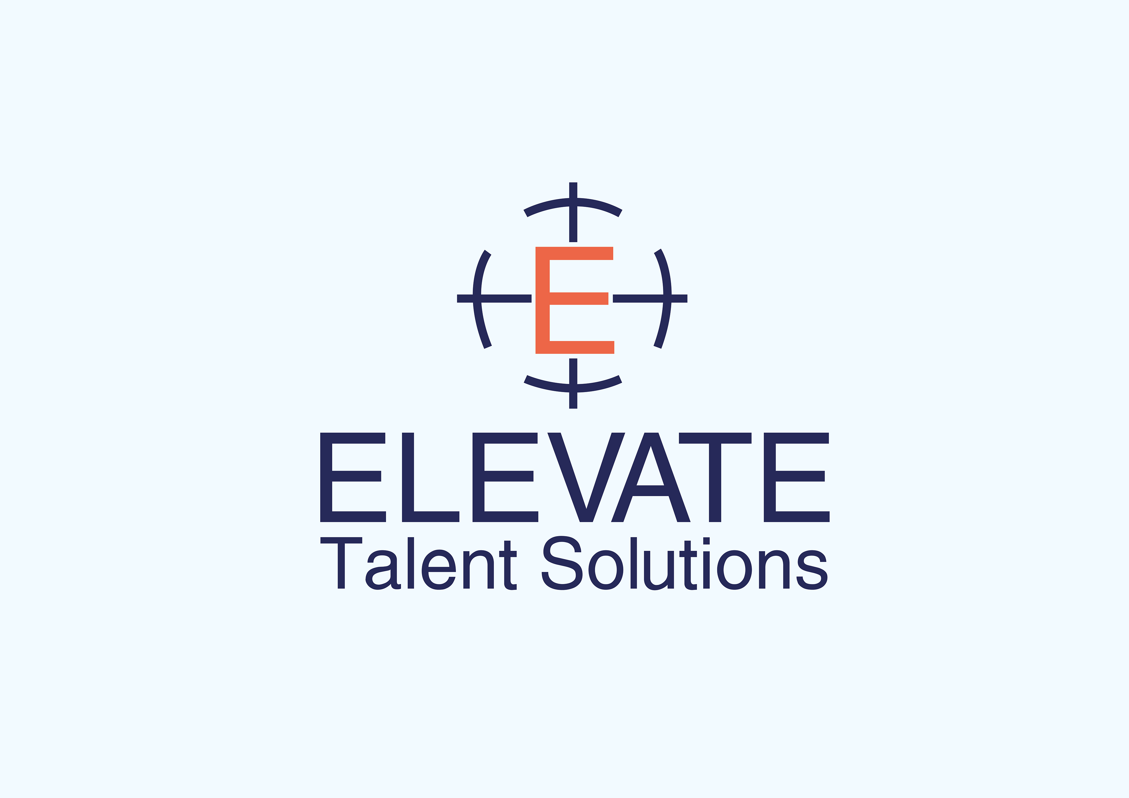
A stylized "E" is placed within the center of a circular target symbol, suggesting precision and goal-oriented focus. The color palette combines a calming blue and a vibrant orange, creating a balanced and visually appealing look. The company name, "Elevate Talent Solutions," is displayed below the symbol in a modern and straightforward sans-serif font. The overall design conveys a sense of professionalism, strategy, and a commitment to achieving results, aligning with the company's role in talent acquisition and development.
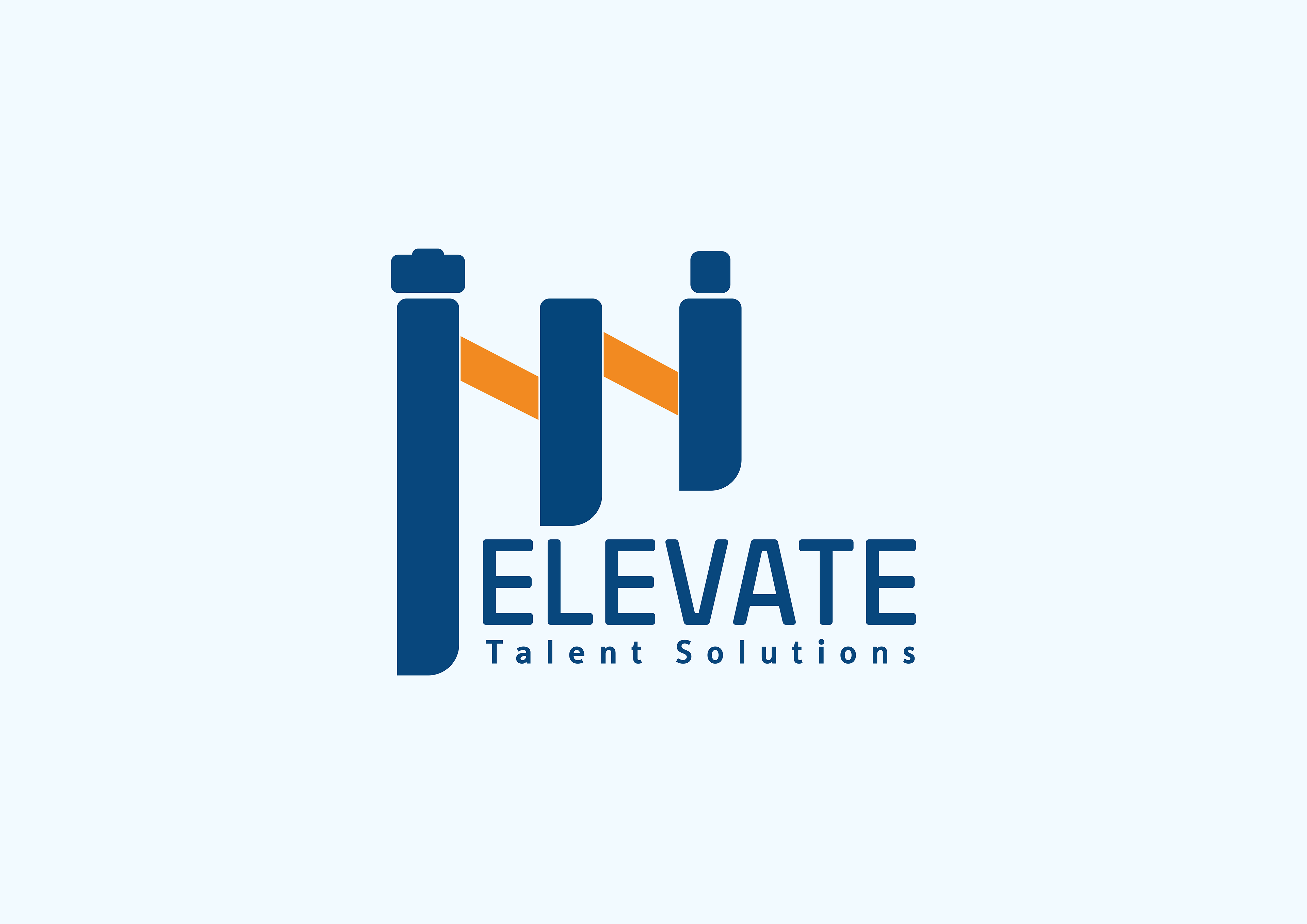
The central element features four vertical bars, two in blue and two in orange, arranged in a pattern that resembles a bridge. This visual metaphor suggests a bridge between opportunities or a journey of growth and companies. The orange bar in the middle is slightly elevated, potentially symbolizing the company's name and its role in elevating talent. The company name, "Elevate Talent Solutions," is placed below the graphic in a modern and straightforward sans-serif font, maintaining a consistent visual style. The color palette of blue and orange conveys trust, reliability, and energy. The overall design is simple, yet impactful, effectively communicating the company's focus on connecting talent with opportunities and facilitating career growth.
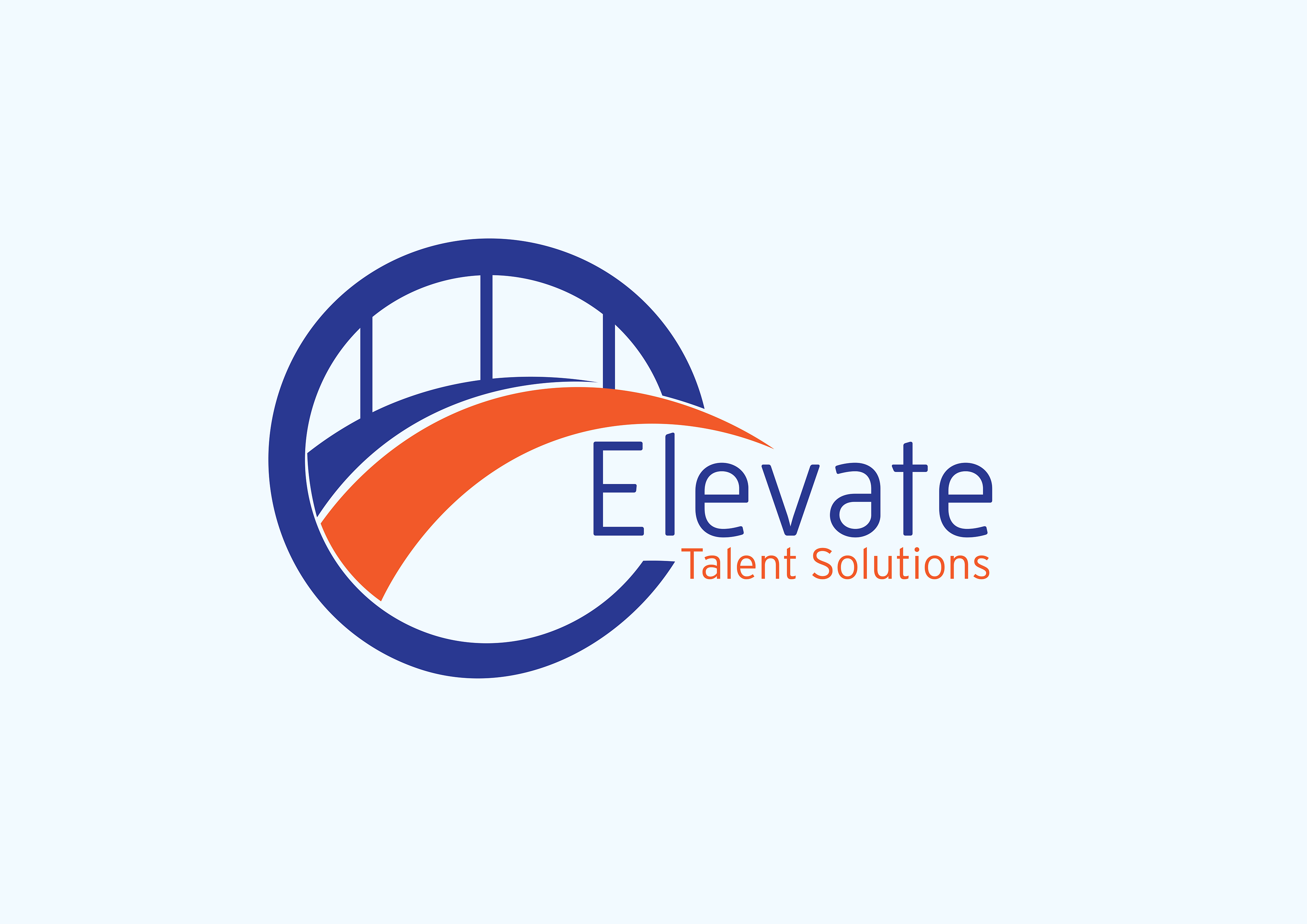
A vibrant orange curve forms a stylized "E" within a circular frame outlined in blue. This "E" is cleverly integrated with the shape of a bridge, symbolizing connection and progression. The blue circle evokes stability and trust, while the orange curve adds energy and dynamism. The company name, "Elevate Talent Solutions," is overlapping the graphic in a clean sans-serif font, maintaining a consistent visual style. The logo effectively communicates the company's role in bridging gaps, connecting talent with opportunities, and facilitating growth and advancement.
This logo presents a dynamic and upward-focused design. An upward spiral shape, symbolizing growth, progress, and collaboration. The upward trajectory of the spiral is accentuated by an arrow, reinforcing the idea of elevation and reaching new heights. The color palette of blue and orange conveys a sense of professionalism and energy. The company name, "Elevate Talent Solutions," is placed below the graphic in a modern and straightforward sans-serif font, maintaining a consistent visual style. The logo effectively communicates the company's role in fostering growth, development, and career advancement for both individuals and businesses.
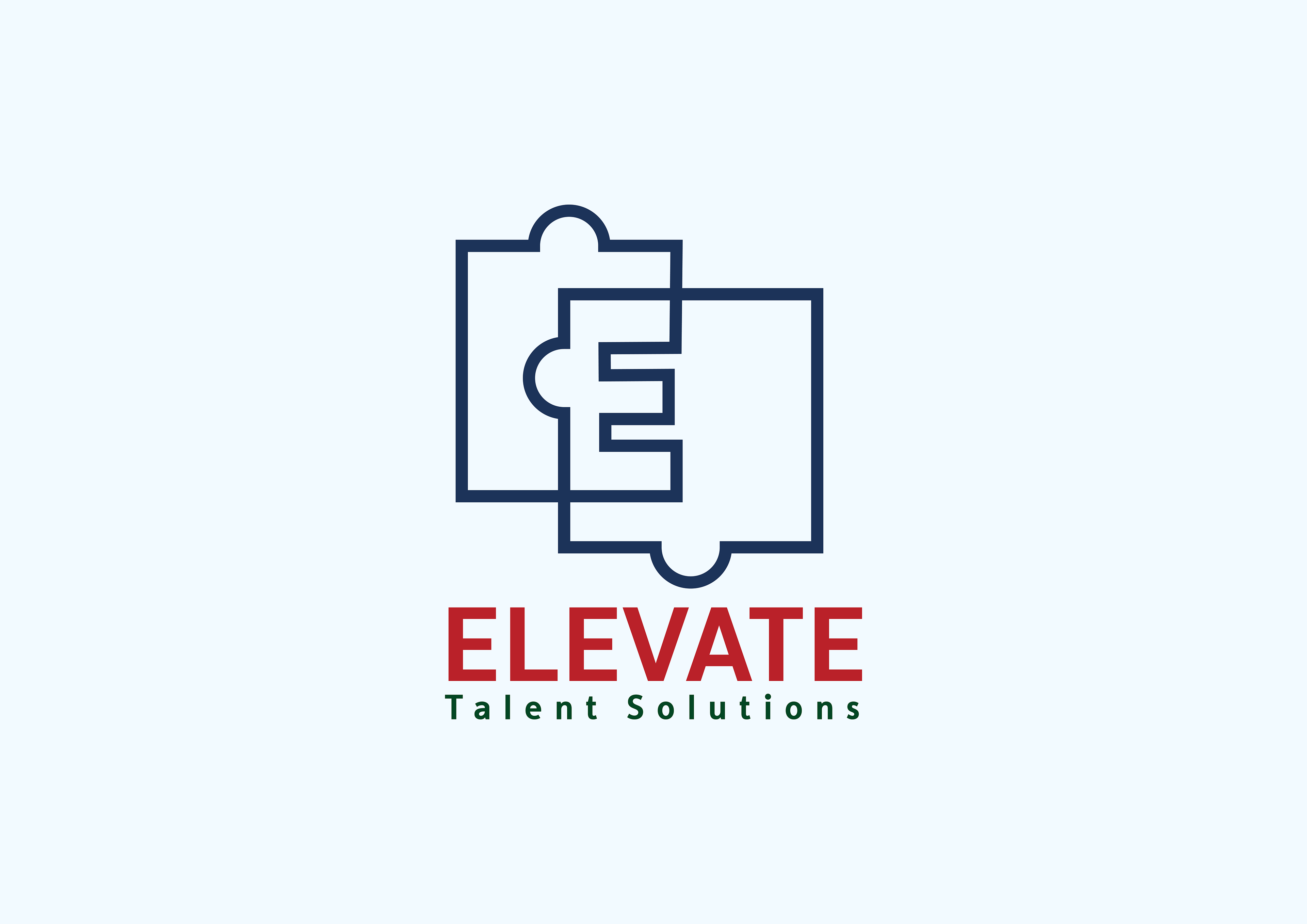
The image depicts a logo for "Elevate Talent Solutions." The design incorporates two puzzle pieces to form a larger whole. The intertwining shapes symbolize connection, collaboration, and problem-solving. The word "Elevate" is written in bold red letters, positioned above the phrase "Talent Solutions" in a darker shade of red. The overall color scheme is striking and professional, with the red and blue creating a sense of balance and energy.
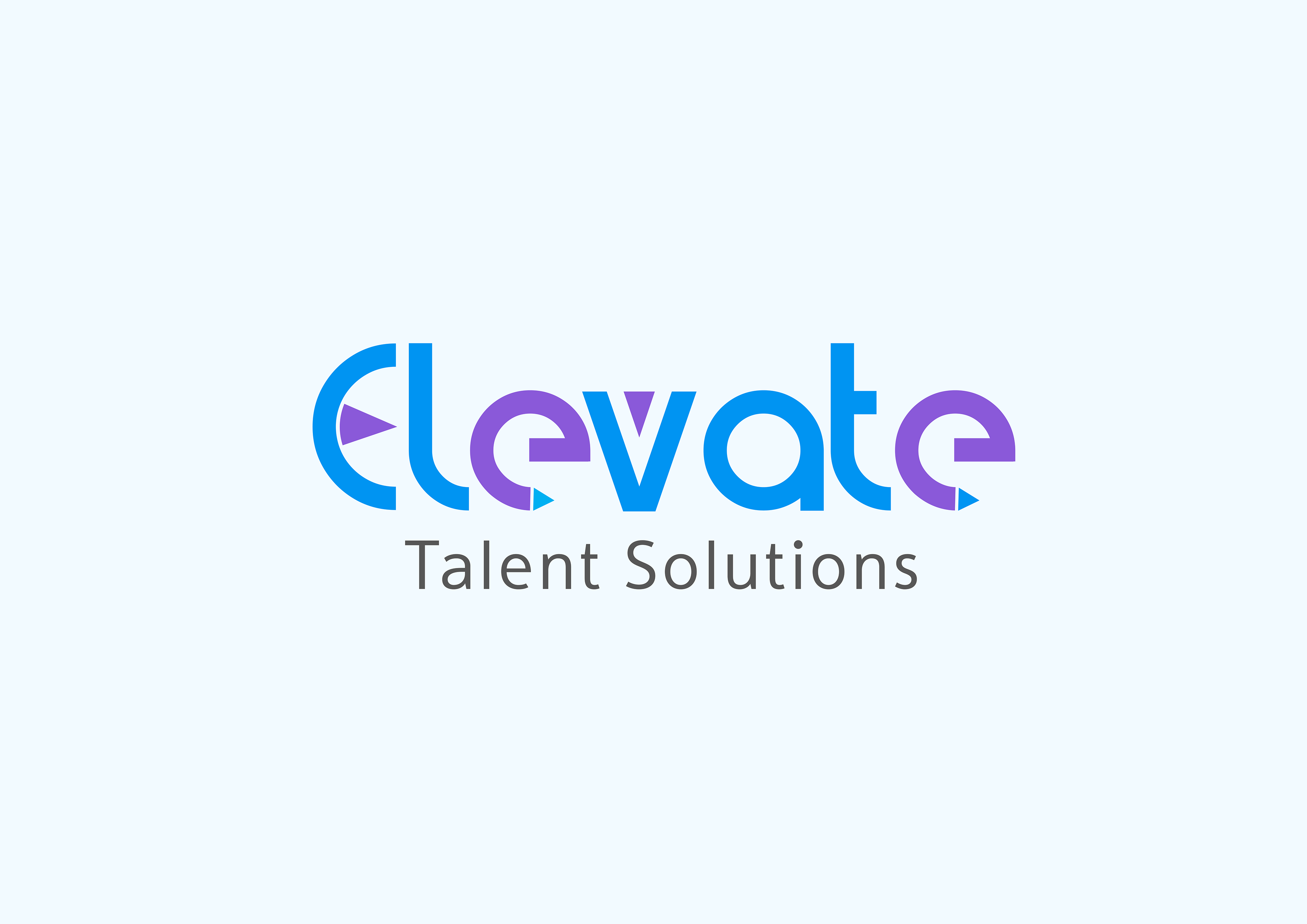
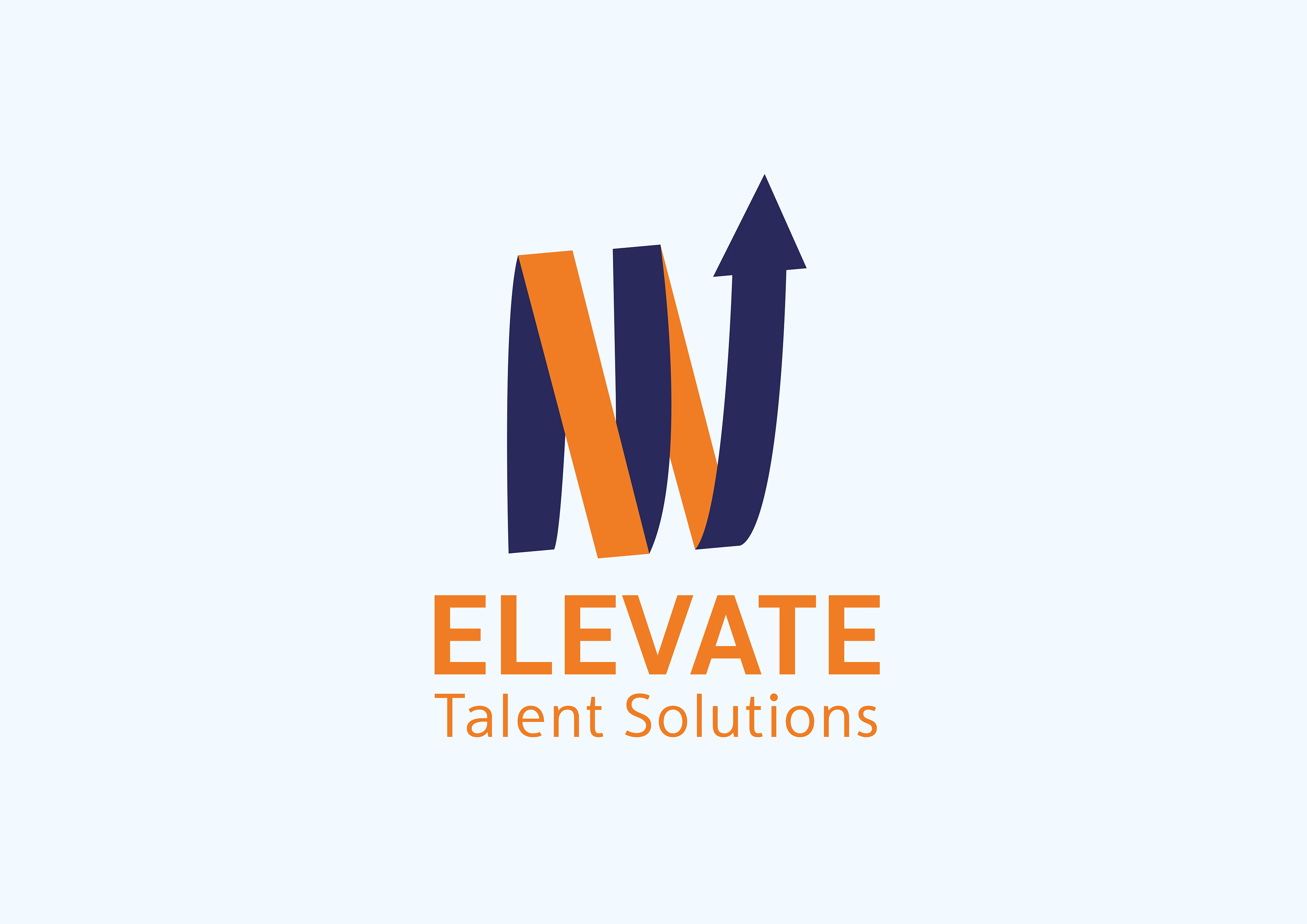
The logo presents a dynamic and forward-thinking design. The word "Elevate" is formed with overlapping shapes in shades of blue and purple, creating a sense of movement and progression. Embedded within the letters are subtle arrow-like shapes, emphasizing direction and advancement. The typography is clean and modern, complementing the overall energetic feel. The logo effectively conveys a sense of innovation, growth, and strategic direction, aligning with the company's role in elevating talent and career paths.


